DUNKIN' Rebranding
DUNKIN' Rebranding
OVERVIEW
This project reimagines the visual identity of Dunkin’ using LovArt AI to explore new design directions. The redesign modernizes the brand while preserving its iconic orange and pink palette. Updated typography, refined graphic elements, and a flexible visual system position Dunkin’ as an energetic, contemporary coffee brand for today’s fast-paced lifestyle.
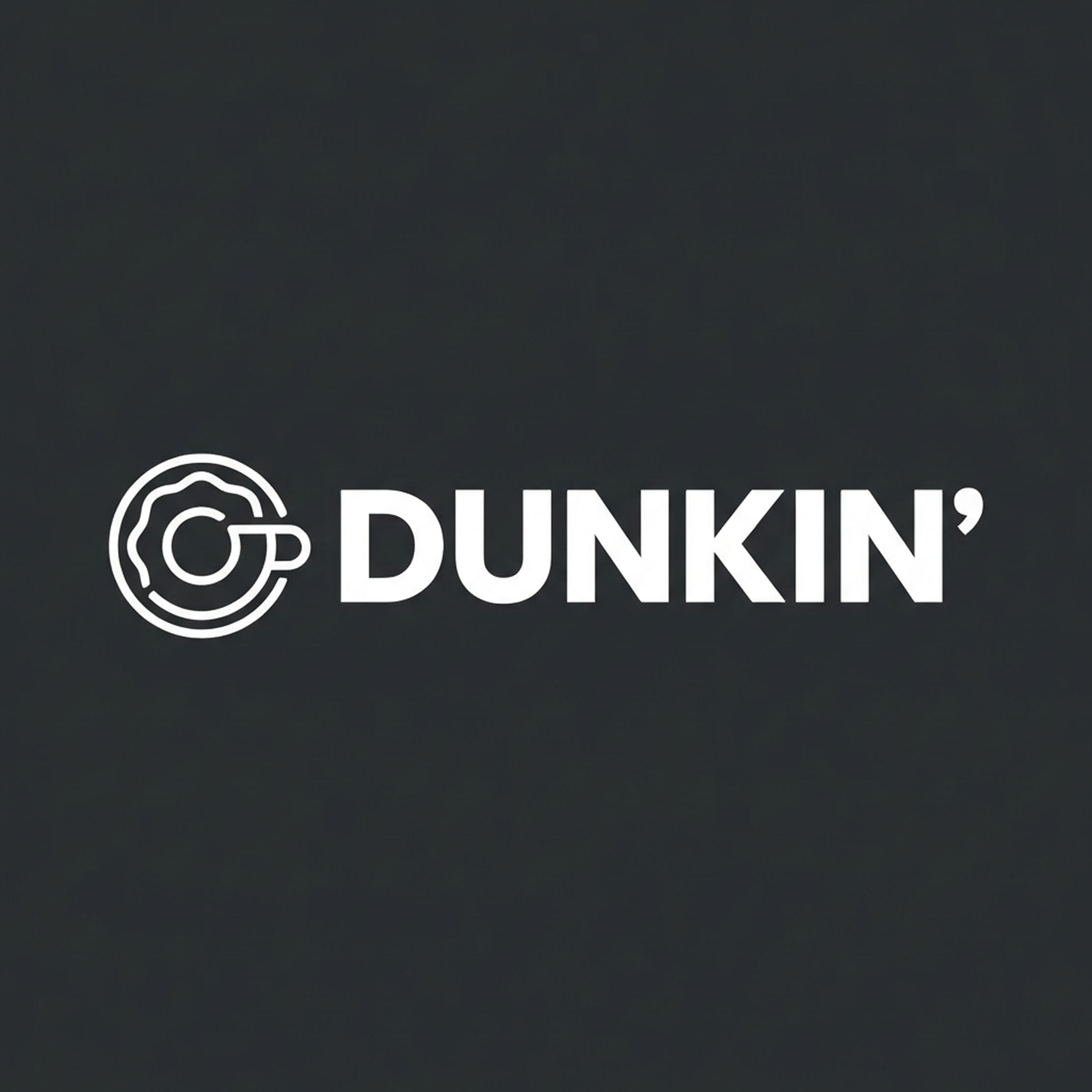
LOGO VARIATIONS
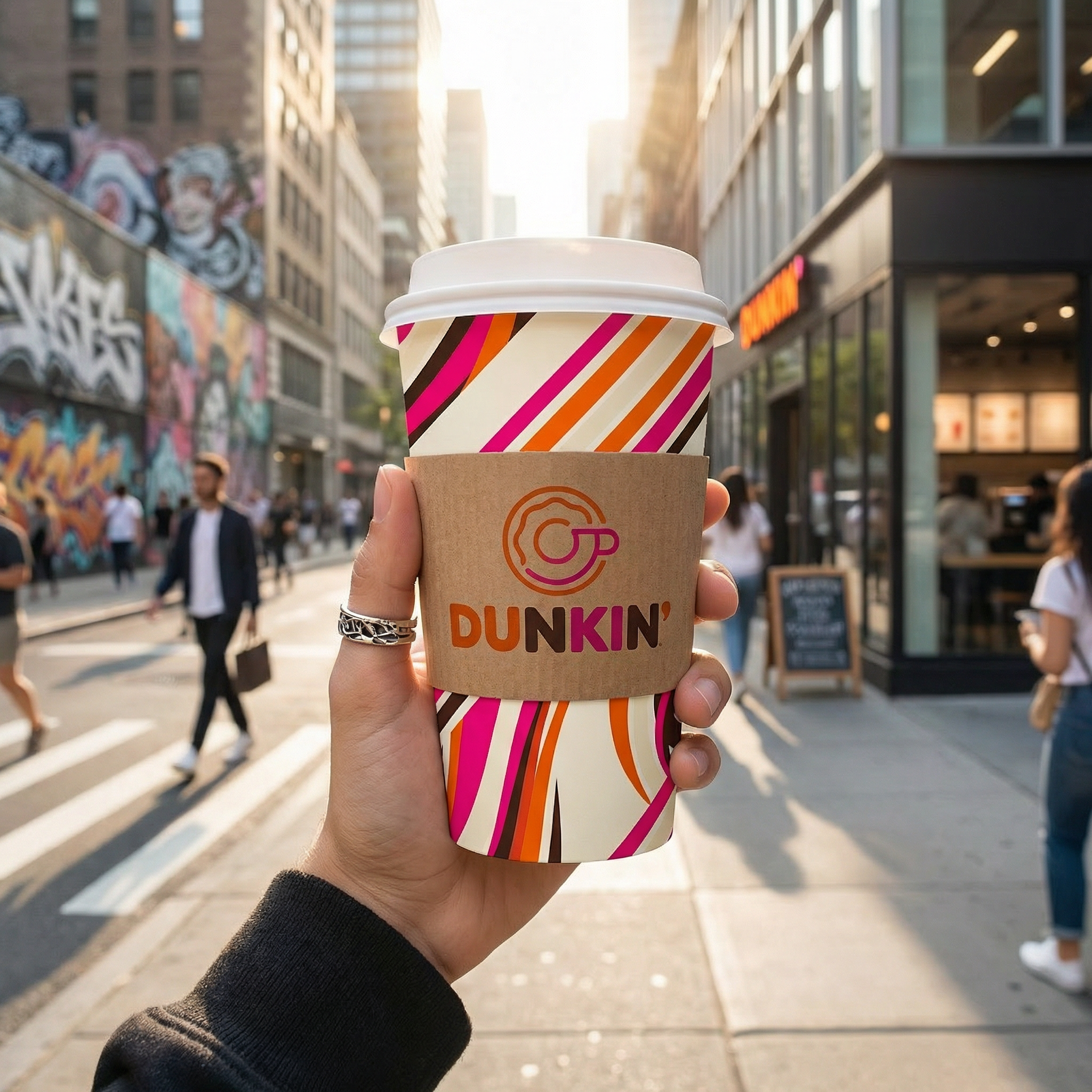
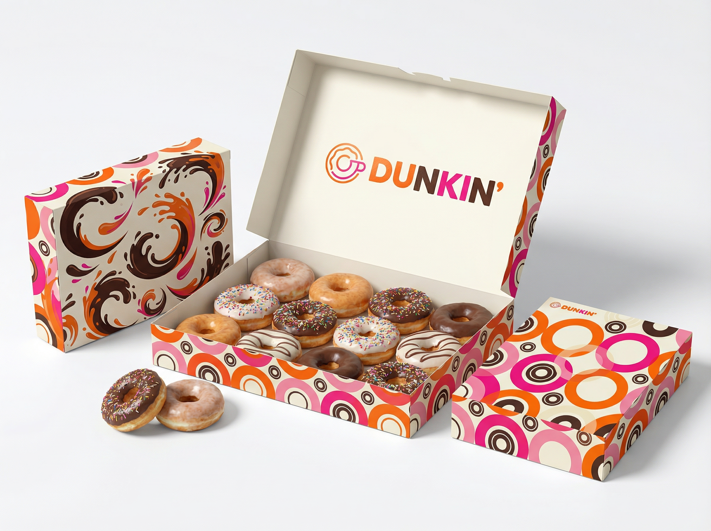
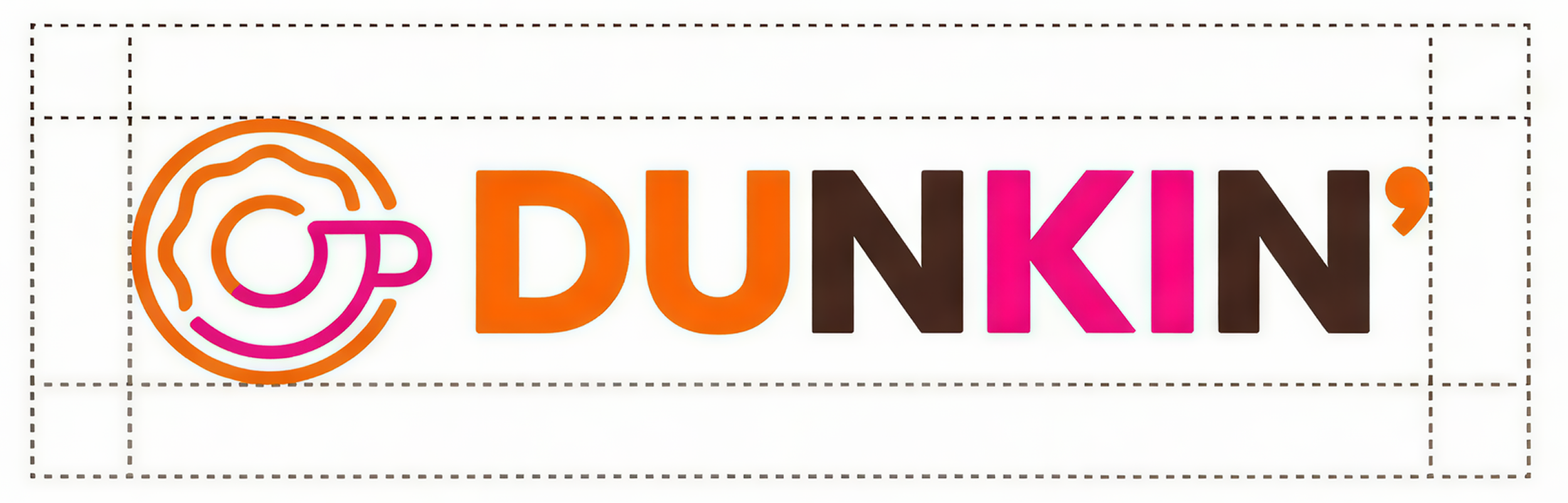
Primary Logo
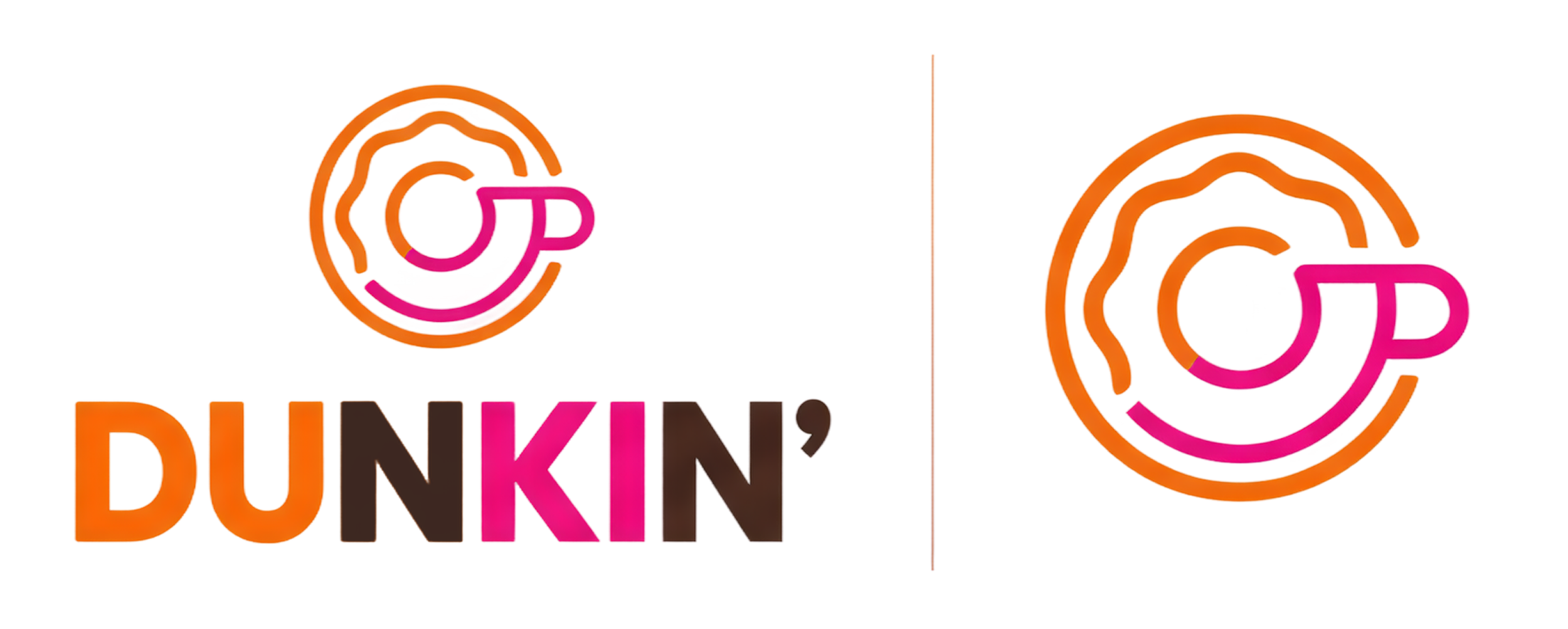
Secondary Logos & Icon
Logo Clear Space
To maintain visual clarity, a minimum clear space must surround the Dunkin’ logo at all times. The clear space is defined by the height of the letter “D” in the wordmark. No text, images, or graphic elements may enter this protected area.
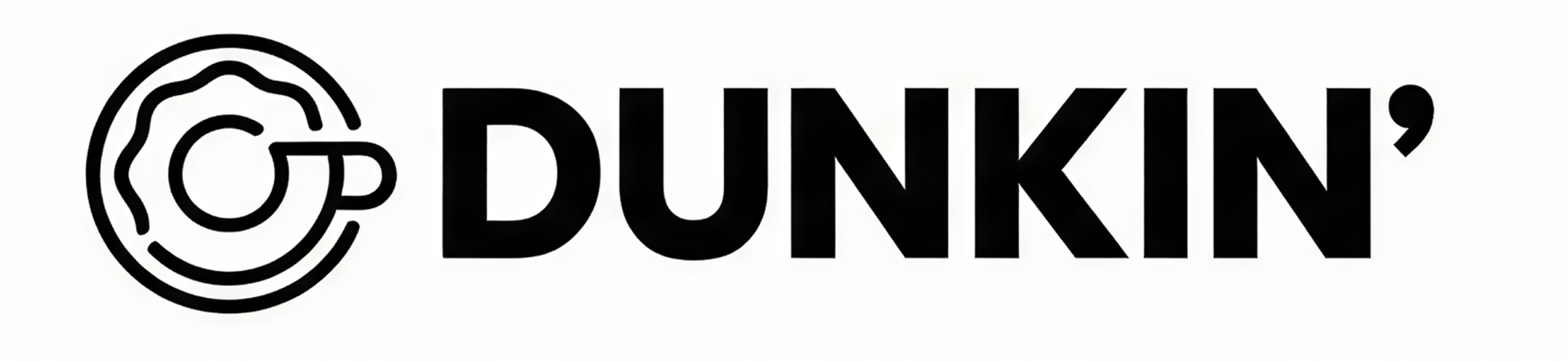
Monochrome Logo
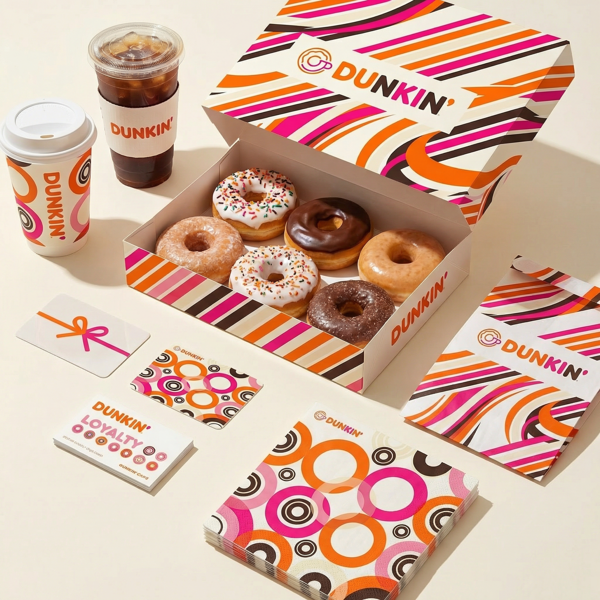
COLOR PALETTE
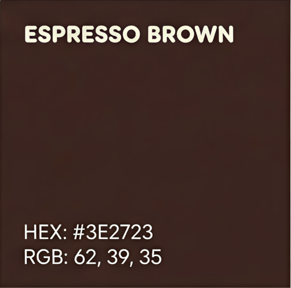
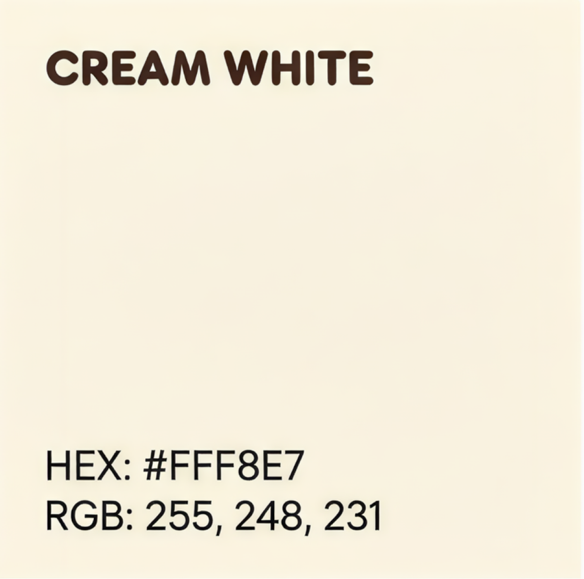
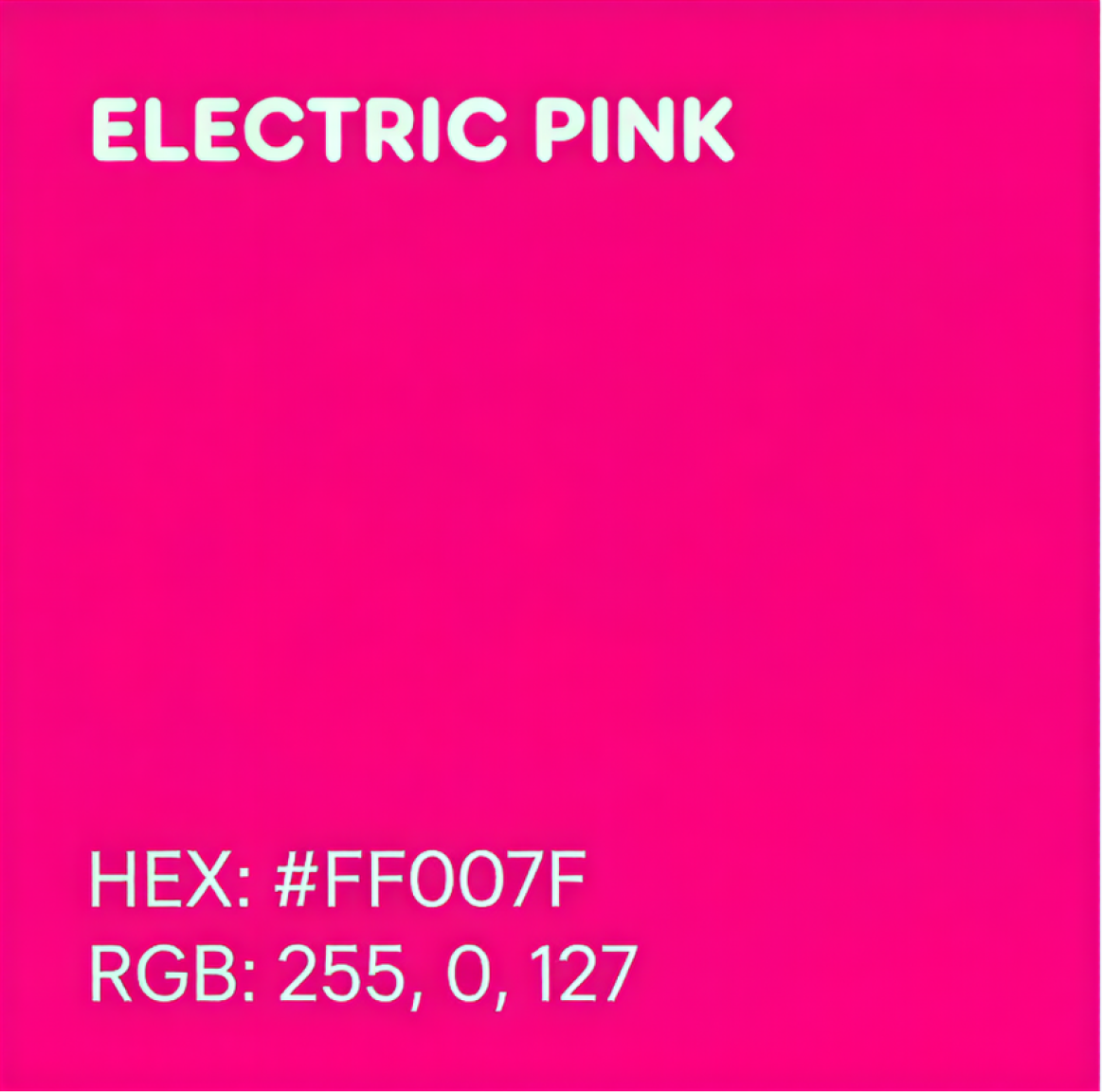
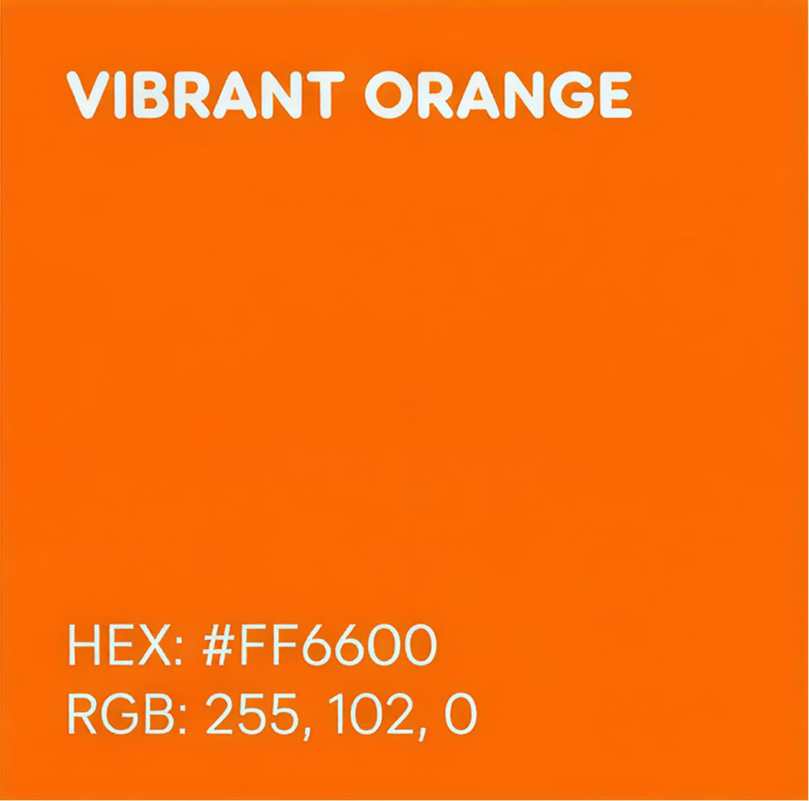
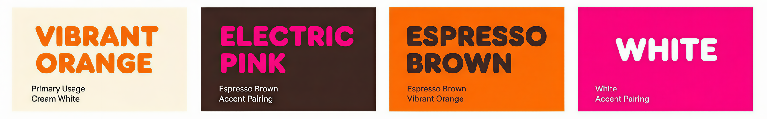
Vibrant Color System
The Dunkin’ color palette is built around its iconic orange and pink tones. Orange represents energy and warmth, while pink introduces playfulness and contrast. Supporting neutral colors such as cream and espresso brown provides balance and flexibility across packaging, environments, and digital applications.
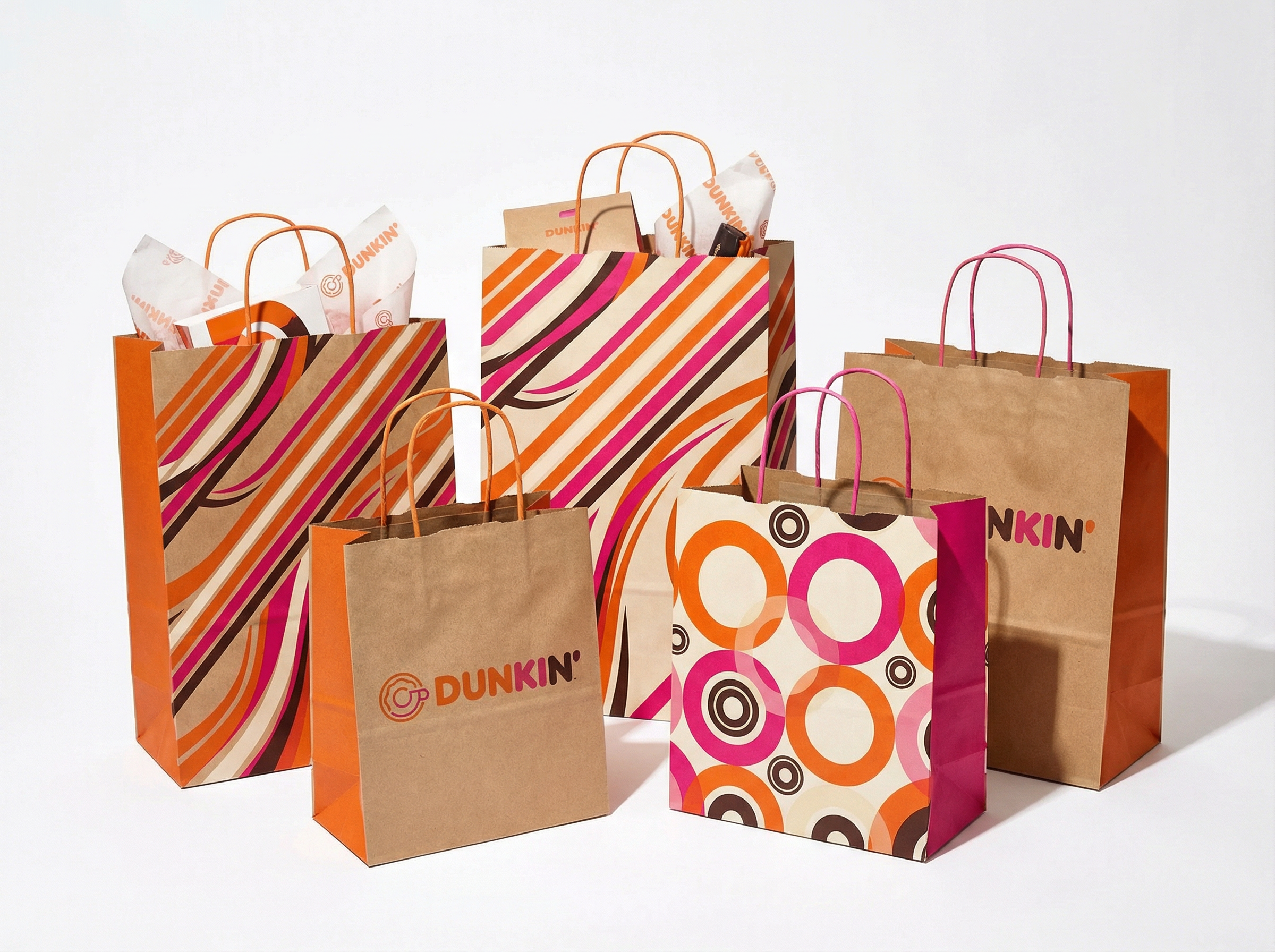
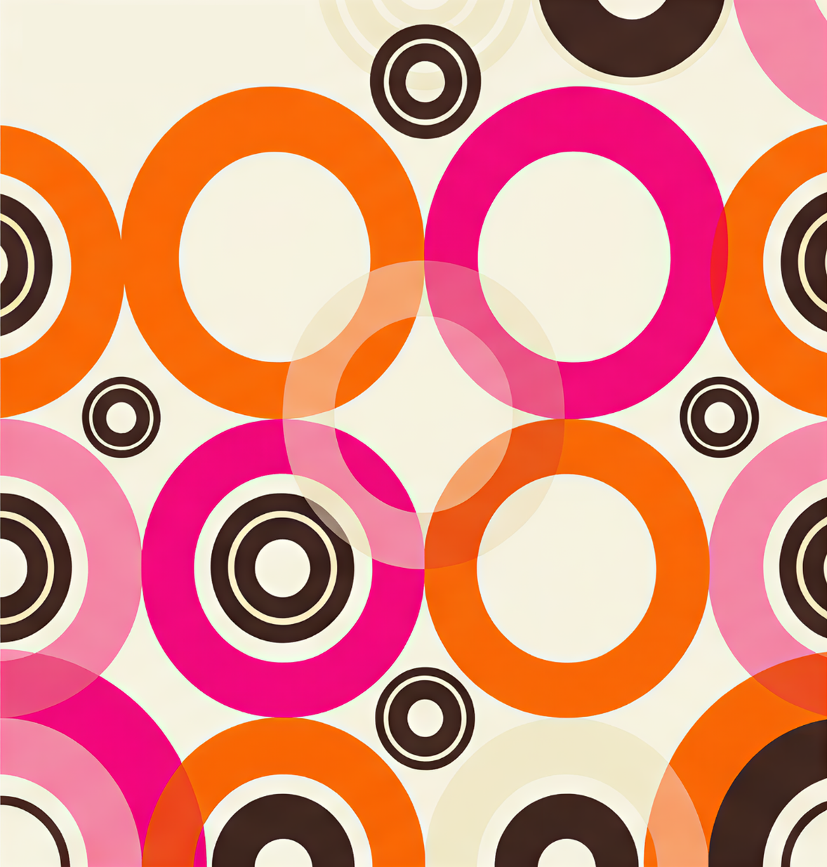
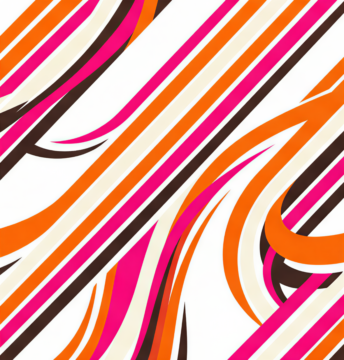
GRAPHIC ELEMENTS
Fluid Patterns
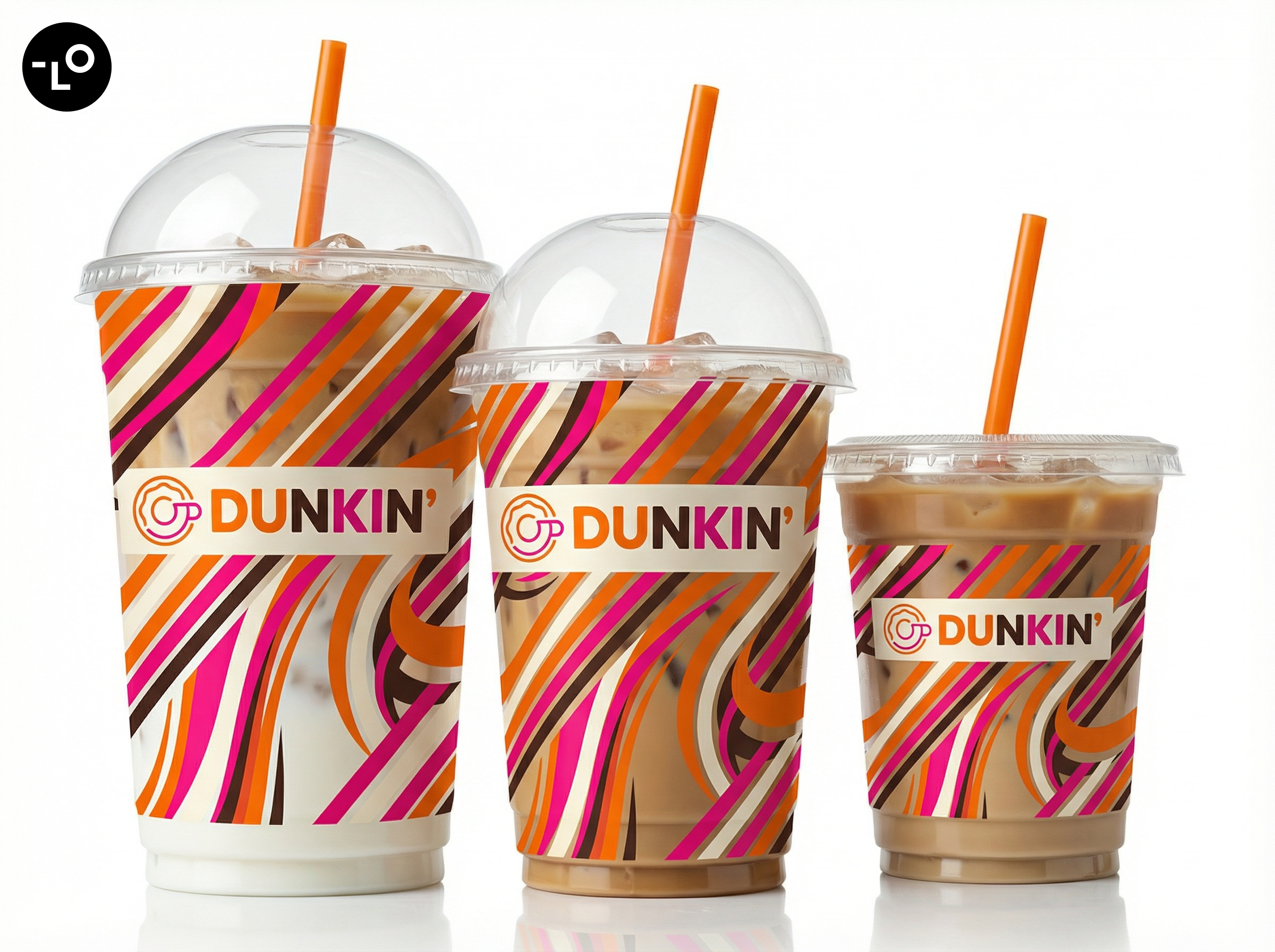
I developed a set of bold geometric shapes and dynamic graphic elements to reinforce the brand’s energetic and modern identity. These visuals add movement and structure to the design system while helping create a consistent look across packaging, environments, and digital applications.

TYPOGRAPHY GUIDELINES
Font
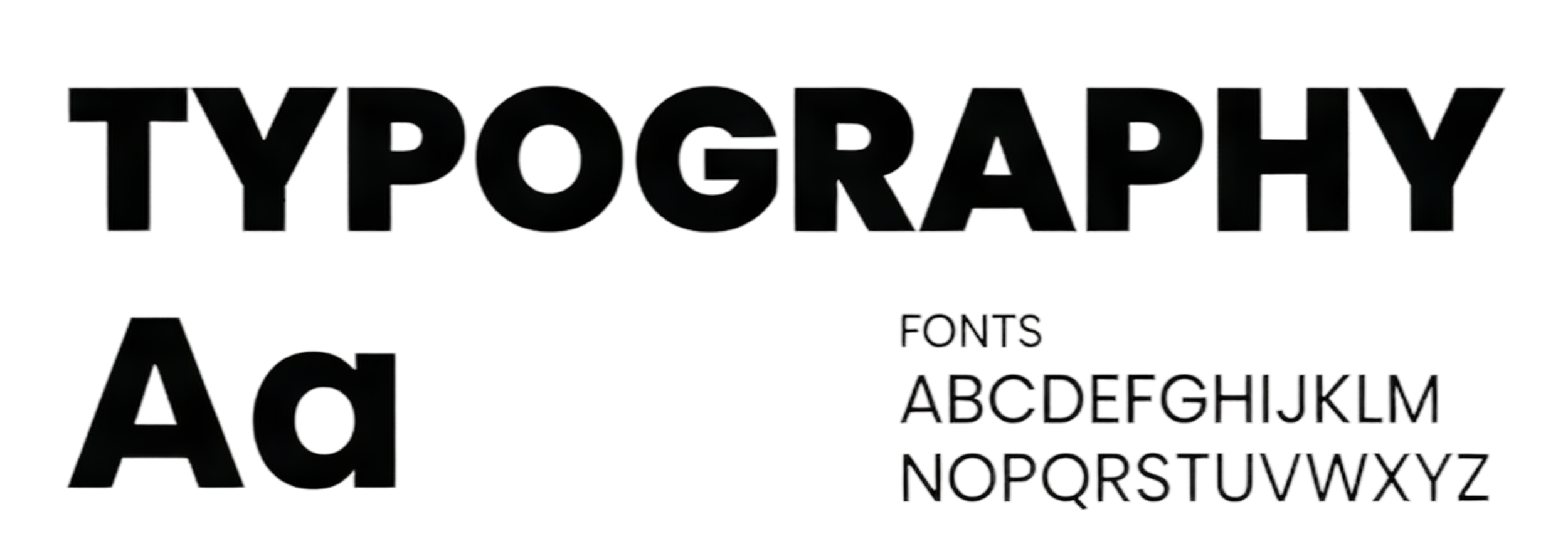
Bold Sans-Serif Typography
I chose a bold, geometric sans-serif typeface to express the energy and contemporary spirit of the brand. The sharp edges create a stronger and more confident visual presence, while the clean structure ensures readability across packaging, signage, and digital applications. This typographic approach helps modernize the brand while keeping the identity clear and impactful.
SHOWCASE